Web Usability of Aarong E-Commerce
Aarong is the leading fashion house in Bangladesh and pioneer in promoting the fashion industry of Bangladesh. Aarong established in 1978, inspired by the principle of ‘To provide a stable and gainful source of employment for the underprivileged rural artisans, lift up the traditional identity and the commitment of quality service’. The three basic characteristics of Aarong are Quality, Originality and Uniqueness. It is an enterprise of BRAC. Collaborating with Ayesha Abed Foundation (AAF), Aarong is conducting its all operations. Aarong, an iconic Bangladeshi brand and the country’s largest retail chain, offers customers over 100 fashion and lifestyle product lines, including designer clothing, household items and jewellery, all of which bear the promise of exceptional quality and value. The rich tradition of Bangladeshi craft and folk art returned to prominence through Aarong, which, for the last 32 years, has been creatively blending traditional and ethnic craft-skills with contemporary styles and trends. Aarong works with over 1,600 artisan groups, ensuring the livelihood of over 65,000 artisans and directly benefiting 320,000 people across Bangladesh. The main goal of Aarong is to help the marginalized people of Bangladesh. Besides protecting and promoting Bangladeshi products and designs which contain the essence of Bangladeshi culture and beauty into every piece. The key values of Aarong are quality products and services, concern for people, especially for producers, promoting and creating demand for Bangladeshi crafts and craft-related skills, teamwork, gender equity, creativity and innovation and environmental consciousness. Aarong represents the global village.
According to the organization, lack of working capital, marketing support and opportunity for skills development are the three main obstacles for gainful employment in the rural areas. As it is a social enterprise, it provides some services for low income and marginalized people in the rural areas for overcoming the three obstacles. Most of the people of Bangladesh live in the rural areas. Rural people are the most disadvantageous and marginalized people and for these underprivileged people Aarong has developed a space collaborating with Ayesha Abed Foundation. Aarong is supporting more than 2000 villages by utilizing their artistic skills and helping them to earn for living. Nearly 65000 rural artisans and handicraft producers are involved with Aarong out of which 85% of them are women. At present Aarong have 13 production centres and 653 sub-centres across the country. As a result of significant contribution of these artisans and handicraft producers Aarong has more than 100 product lines at present.
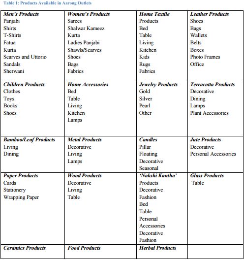
Aarong’s product range includes men products, women products, children products, home textile, home accessories, jewelry products, leather products and so on. At present it has 14 domestic outlets in Bangladesh. These are 6 outlets in Dhaka, 2 in Chittagong, 1 in Sylhet, 1 in Moulvibazar, 1 in Comilla and 1 in Khulna. Apart from Bangladesh, in London Aarong has 1 franchise outlet. Two new outlets have been opened recently in Dhaka. One of the outlets is in Dhanmondi-2 and second one is in Banani. It is representing the culture of Bangladesh to the foreign countries. Since 1984 this organization is in the export market. Aarong exports their products to Italy, U.K., Spain, Canada, Japan, Australia etc. Out of 100% buyers of export market, 85% of the buyers are leading fair trade buyers and 15% of the buyers are commercial buyers including London outlet. At present Aarong has grown as a prosperous international enterprise making the local, ethnic crafts available to the international market. Aarong has successfully included into its wide and diverse spectrum of beautiful crafts from silks, handloom cotton, endi to terracotta, bamboo, jute and much more.
Aarong’s target customers include –
-The urban and middle to upper class Bangladeshis and expatriates;
– Bangladeshis living abroad who are looking for products that connect them to their country and roots and represent their identity as a Bangladeshi;
– Foreigners visiting Bangladesh, Aarong is a must-visit destination that has a prominent mention in The Lonely Planet guide to Bangladesh.
Naming:
The word ‘Aarong’ is a Bengali word which means ‘a village fair or market’. A village fair is a great event to the villagers. In a village fair artisans and craftsmen get the opportunity to show their talents and display their handcrafted traditional products for selling. The name Aarong represents the organizations commitment towards promoting traditional Bangladeshi products and designs which are handcrafted by rural artisans and handicraft producers around the country.
In addition the products of Aarong have the essence of Bangladeshi culture and beauty into every piece. Keeping these thoughts in mind, the organization has named as ‘Aarong’.
Logo:
The logo of Aarong is the image of a peacock. This logo indicates that Aarong products are eyecatching and unique as a peacock. Moreover, it also emphasize on its natural, eco-friendly products through the symbol of the peacock. There are two colours in the Aarong‟s logo. One is black and another is orange. Black represents professionalism and orange represents energy.
History:
In 1972, BRAC, largest NGO of the world was established. Then in 1976, BRAC dedicated to reduce poverty and empowering the underprivileged people. As a result it started a small initiative to promote sericulture among the women of Manikganj. In 1978 Aarong was born in need of helping the disadvantaged, poor silk farmers of Manikganj. Their visionary goal to change the lives of deprived artisans and underprivileged rural women by enlivening and encouraging their arts and crafts. At the very beginning their target customers were few merchants of Dhaka. Within few years Aarong expanded from one single shop to the biggest retail chains of Bangladesh. Now, Aarong has a big family of 65,000 artisans with artists including weavers, potters, brass workers, jewelers, jute workers, basket weavers, wood carvers, leather workers and more. Among these artisans, 85% of them are rural women which show positive indications towards empowering women. Today, it can be easily said that Aarong has become the biggest platform for the independent groups and family-based initiative for selling their crafts in the national and international market. Aarong is stands as the interfacing bridge through which rural artisans and women can sell their home-made handicraft products and contribute in the income of their family.
Products / Services Offering:
Aarong is a leading fashion house in Bangladesh. Though it was started its journey in need of helping the disadvantaged, poor silk farmers of Manikganj, but soon enough Aarong started to grow and expanded throughout the whole country, from one single shop to the biggest retail chains of Bangladesh. Since 1984 this organization has also entered export market. The product lines of Aarong have also grown up with the growth of the organization. At present Aarong have more than 100 product lines. The products of Aarong are as follows:
Services:
Aarong provides services to the disadvantaged artisans and unprivileged rural women who work for Aarong. Aarong has formed with the goal to bring positive changes and help the rural marginalized people. For doing this they identified three major lacking areas. Those areas are: working capital, marketing support and opportunity for skill development. According to Aarong these three basic facts are causing obstacles for productive employment in rural areas. To overcome these lacking, Aarong provides some services for their workers and suppliers. Those services are as follows:
- To promote efficiency and productivity instant payment on product delivery.
- For artisans, doing marketing communications and making availability of information.
- To ensure reasonable value for efforts given by producers reaching out to them in remote areas.
- Product development through product design and support.
- To increase product quality and marketability provide training and education skills.
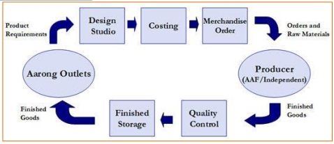
Aarong’s Process Flow:
AARONG E-COMMERCE
www.aarong.com:
On 16th July 2014, Aarong’s website was launched nationally. In 2012 Aarong had a vision to launch an e-commerce site by 2013. However, the whole process of launching the website was delayed by a year and in 2014 it was finally launched. Aarong is one of the first organizations in Bangladesh which brought Western website design to Eastern audiences by providing a highclass user experience. Tamara Abed, Senior Director, BRAC Social Enterprises, said – “Aarong took great care in ensuring that users get a high quality shopping experience in their online shop in sync with the brand promise” (Cochran, 2014). The website was inaugurated in BRAC inn by Governor of Bangladesh Bank Dr Atiur Rahman. BRAC founder and Chairperson, Sir Fazle Hasan Abed was present as the special guest in the inauguration ceremony. On the occasion among others, executive director of Asiatic JWT and media personality Iresh Zaker and BRAC Business School faculty Tahsan Khan were also present on the occasion.
The slogan of Aarong E-commerce is ‘Shop Online’. Internationally no products are sold in the website. All the delivery is done in Bangladesh only. However, international customers can order online and the delivery is given to any Bangladeshi address.
DOOR3 worked as strategic partner of Aarong for digital marketing and website design (Cochran, 2014). However, whole website is managed by “CIGNEX Datamatics” on magento. The promotional activities of Aarong.com are handled by the marketing team of Aarong. At the moment in three news portals Aarong.com promotes. They are Dhaka tribune, bdnews24 and prothomalo.com. Some of the promotional activities are done through the facebook page of Aarong. On their facebook page the links are provided to take the customers directly to the website for buying products. The branding and marketing of Aarong E-commerce is done in the department itself.
Aarong.com tries to sell almost all the products which are available in the outlets. The products are packed in boxes and envelops. These envelop and boxes are developed in the Aarong ecommerce department.
Work Process in Aarong E-commerce:
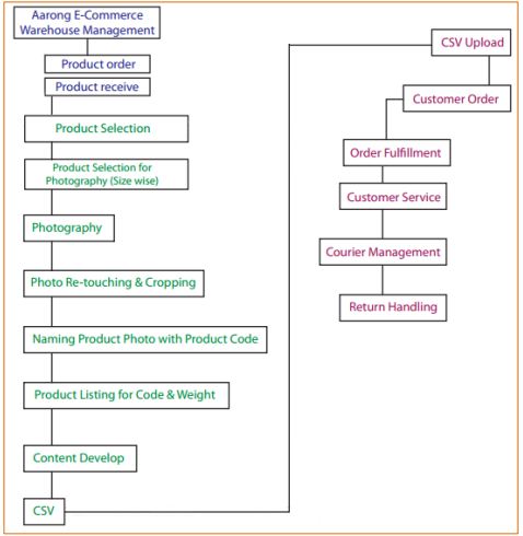
The image above shows the working process that happens in Aarong E-commerce.
Products requisition is given to the central store by the Aarong E-commerce warehouse management. From there the products are sent to the warehouse of Aarong E-commerce. From the products, mannequin size products are chosen. Then the products are sent for photoshoot. After photo shoot pictures are sorted and edited those are coded. A spreadsheet is prepared where the codes of the products along with many products related all kind of information and content are recorded. The excel sheet for the products have about 75-80 columns depending on the product. This process is known as the CSV (Comma Separate Value). Once this step is finished the data is uploaded which appears in the website are ready for the customers.
Products in Aarong’s Website:
Mohammad Abdur Rouf, chief operating officer of Aarong said -“We should only put up the exact items we want to sell online. It is vital to win consumer credibility” (The Daily Star, 2014). Products sold in the outlets and products selling in Aarong website have difference. It is that, there are products in the outlets which are not available in the website. The categories and dividing products accordingly is also different here. Products like glass tables, herbal products, expensive sarees and other textile materials, the non-textile products which are easily breakable are avoided being sold in the website of Aarong. According to what COO said, Aarong ecommerce selling only the products which are easy to deliver and which the customers will buy from the online shop. They have put up the exact products which they want to sell through the website.
Under Aarong, the have the brand Tagaa, which also have its own page and own clothing line. These products are also available to shop online in the Aarong website.
Recently launched Rattan furniture has been made available in the website. Customers can order their desired furniture from the website too. The furniture is available only in 2-3 outlets and Aarong’s website.
ANALYSIS AND FINDINGS
In this report the web usability of Aarong e-commerce has been analysed. The problems in the website are identified and some solutions have been recommended. The websites usability is also compared to its competitors.
At first, let us see what is web usability?
The ease with which the users use a websites is known as the Web Usability. It is the presentation and quality of the websites which makes the users comfortable while using the websites. The meaning of web usability is the smoothness of utilization of a website. In the perception of e-commerce websites, web-usability is narrowed down to efficiency, triggering sales and/or performing other transactions significant to the business. The concept of usability can be defined as “how well and how easily a user, without formal training, can interact with an information system of a website” (Benbunan-Fich, 2001). Bernard et al. (1981) suggested that a “truly usable system must be compatible not only with the characteristics of human perception and action, but, most critically, with users’ cognitive skills in communication, understanding, memory, and problem solving.” A usability evaluation consequently assesses the ease of use of a website functions and how well they enable users to perform their tasks efficiently. Subsequently, usability is a more comprehensive build than usefulness.
Below the web usability of the website of Aarong is analysed. Then it is compared with its competitor’s websites.
Problems in Aarong’s Website:
I worked on the website ‘www.aarong.com’ of BRAC-Aarong for my internship report. The web usability of the Aarong’s website is below the standard of such a big organization like Aarong. The time to load the site requires very less seconds, but the contents of the site do not provide what the visitors looks for. The information is very limited. The content is not clear along with many other navigation problems.
The site was accessed on 15th March 2015 for doing the analysis and also on 27th May. The web usability problem of the website of Aarong is discussed below-
Web Usability Issues: Meta-Analysis of Aarong’s website:
Meta Description:
Meta Description of the website ‘www.aarong.com’ is vague in the source data. According to the Google, (2010) -“A page’s description Meta tag gives Google and other search engines a summary of what the page is about” (p. 6). One of the mistakes the company made while creating the website is that they ignored the importance of Meta description. Below that the Meta description appears which does not shows the clear explanation about what the company is all about. The description about the company is vague. The number of clicks by the visitors depends on these descriptions. If the descriptions are not clear, visitors will not click on the websites to check about it.
Meta Title:
Google, (2010) suggests -“A title tag tells both users and search engines what the topic of a particular page is” (p. 4). Adding a good Meta title to any web page helps to raise its ranking in the search engines. However in case of Aarong, it does not have a good Meta title. Aarong sells both textile and non-textile products in their virtual shop. However it does not get reflected trough the title of their website. Even though the Meta title of Aarong’s website is 61 characters without space and 71 characters with space, the title not clearly defined.
Meta Keyword:
A specific type of Meta tag that appears in the HTML code of a web page is known as the Meta keyword. It helps to inform the search engines regarding what the topic of the page is about. The keywords in Aarong.com website are very limited. The Meta keywords prepared for Aarong by DOOR3 have been added in the appendix. More words should be added so that when people search for the products of any kinds they get the desired result.
Search Engine Optimization:
The website of Aarong is facing the search engine optimization issues due to the vague description of the organization. As a result when searched about the website ranks low and sometimes doesn’t appear at all.
When ‘online shopping for clothing’ or ‘shalwar kameez online shopping’ in Bangladesh are searched in Google, the website of Aarong does not appear on the first page neither on the next 2 to 3 pages. It actually appears in the bottom of fifth page when ‘shalwar kameez online shopping in Bangladesh’ is searched in Google. During the search for ‘online shopping for clothing in Bangladesh’, www.aarong.com does not appear in the result for the first five pages. The content about what the website is about is not mentioned in a clear way. Hence, when searched about online shops for clothing located in Bangladesh, Aarong’s website is ranked low or doesn’t appear at all.
Browser Compatibility:
Aarong’s website faces compatibility issues in the browsers like Firefox, Chrome and Internet Explorer. In chrome, the website of Aarong loads faster. Even though it shows only 1.62 seconds to load in Pingdom, it takes much more time in reality to load. A customer may not wait for so many seconds to load only the home page of the site. Coming to the browsers like Firefox and internet explorer, Aarong’s website faces the most problems in these browsers. In Bangladesh many customers prefer using Firefox or even internet explorer over chrome. In Firefox, the times required to load the website sometimes crosses more than 10 seconds. A customer might not like this wait for loading the site and he or she might close and it look for another site. However, the time required for the website to show up in Internet Explorer is more than 1 minute. Even when it loads the screen is blank. After sometime, even if it loads the whole page of the website shows up disorganized. No customer will wait for so many seconds for a website to show up or even for browsing and buying products from an disorganized page. This is because the times requires for loading product pages and the process to confirm order takes much more time than it takes in Chrome. The screenshots have been added in the appendix.
Product details:
The description of the products is not so clear. Aarong sells textile and non textile products through their website. For such kind of products it is essential to provide detailed description of the products. For example, for any kind of clothing the colour of the clothes, material, fabric used, designs, length, height etc. is necessary to give a perfect description for the customers who decide to but the product from the website. The detailing for the products gives customers idea about how the products are. They cannot touch the product but reading description they can get the idea about it which helps them to decide if they want the product or the product meets their requirement. Aarong’s product descriptions and information are given in different pages which increase the number of layers to know about a product. Many customers may not check the information. The product description should have everything written about the product in detail. In my opinion the description Aarong’s website is providing is vague.
Service Usability Issue:
Some of the problems mentioned below are compiled after getting to know about the feedback given by the customers to the customer care.
Payment Issues:
Product payment is done by using credit cards, cash on delivery, bkash etc. However, from some of the places cash on delivery is not accepted. In Bangladesh, the customers are still not secure about other payment services; they prefer cash on delivery over credit card or bkash payments. Aarong does not take cash on delivery from some areas of Moulovibazar, Ponchogor, Nilfamari etc. It creates hurdles for the customers from those locations if they do not prefer other payment methods other than cash on delivery.
The delivery of the products which are paid by using credit cards faces problems many times. A customer who orders from foreign countries using foreign credit or debit cards faces the payment problems. Their cards might not support the payment in Bangladeshi currency. If there were currency changing options then it would have been easier for foreigners to pay through credit cards. Not only foreigners even some Bangladeshi people using cards for payment face trouble while paying. As a result of these hassles, customers do not retreat from ordering any products from the website.
Registration Hassle:
Registering in the website of Aarong is bit confusing and quite a lengthy process. There are too many steps to follow. In Bangladesh many customers are not tech savvy yet. Complicated registration process creates troubles for the customers most of the times. Even though customers can shop in the website without creating any account but they cannot keep a track on their delivery. Having an account helps to keep a record of their delivered goods. Aarongs website has steps like to give two addresses one for billing and one for shipping the products. To give two same addresses or two different addresses creates confusion on the mind of the customers.
Order Cancellation:
Ordered Products cannot be cancelled in Aarong’s website. If a customer thinks about cancelling the product they will not be able to do so. No option regarding cancelling orders may create inconvenience for the customers. They have to call the customer care of Aarong to cancel the order which is also takes lots of trouble and hassle.
Lengthy Order Placing Process:
According to Bruce Tognazzini “Limit the number of pages and interactions necessary for a user to accomplish his or her task” Chaffey (2009). The layer in order process confuses the customers. It puts resistance accomplishing the task of the customers to order products.
Just like the registration process, the order placing process is also lengthy. There are many steps to follow while adding the product in the shopping bag. Then the shipping address needs to be updated every time with each delivery. Such steps might come off as hassle to some customers. For example, when customer clicks add to bag for a product a pop up comes up to take it to the next step.
RECOMMENDATION
The website of Aarong has to increase their web usability. For a successful website to get more visitors and customers so that they come back again and again to their website for experience effortless and easy web browsing, every company has to improve their web usability. Aarong’s website lacks web usability hence it is not popular and ranks low in search engine optimization.
- The Meta title of Aarong’s website needs to be more advanced and strong to have a better ranking in Google. For example, the Meta title can be “Aarong- The Number#1 Handicraft Fashion House Bangladesh-A BRAC Social Enterprise”.
- The website of Aarong does not have a proper Meta description. The first most important task by the company to improve their website is to add the Meta description which should be to clear and to the point. The Meta description should not exceed 150-160 words and needs to be precise about describing what the company is about and what they do. For example, “Aarong, the handicraft online shop for men, women, kids clothing, products for home, décor, dining, furniture, wooden accents, Nakshi Kantha products, jewelry etc”.
- Proper keywords can be used for Google to recognize and having good ranking and SEO. The web is very densely populated with sites now, it is almost impossible to achieve constant high ratings for a one word search in Google or any other search engines. Achieving constant top ratings for two word or three word search strings is the realistic goal now. Aarong can use keywords like Panjabi for men, kids, boys or shalwar kameez for girls, women etc. keywords for getting a better ranking. It is really very important to choose the right keyword for optimization.
- The main home page of the Aarong’s website lacks the required description of an organization. The description about the company in the home page does not show what the company is all about. The content needs to be written only mentioning about the company and what it is about. Aarong’s website should add more content regarding their company in a brief description, so that the customers at a glance can know what the website is all about and what they are offering. The content of the website of Aarong needs to be written clearly. They content should not be complicated or complex. If the description is complex then Google will not be able to decipher what the company is about hence the ranking will not improve. A searcher for a ‘fashion house’ may want to know about the organization, what they offer and what the company is about and what they do. Aarong needs to re-write their content and clearly mention about their company and its importance.
- Aarong has the only default language which is English. There is no option for changing the language into Bengali. Language options needs to be added in the website. The website is of a Bangladeshi company, so it is important to have the Bengali language option. Many customers may want to read the content in Bengali language. Bengali language option should be added. Apart from Bengali language, the website can even put other languages since many orders come from foreign countries as well.
- The pop out about how the product has been successfully added to shopping bag can be removed as it if unnecessary. It is because even without doing anything in the pop out the products are added to the bag.
- The main banner in the website is filled with promotional stuffs like old banners like the ones from ‘Pohela Boishakh’. Instead of promoting old products, the website should promote their new arrivals or available products in the banners. It will help to attract the customers who will eager to check out the new arrival products.
- The loading issues needs to be fixed so that the entire product shows up. There are times when one products loads and rest does not load or loads half. If the problems are fixed customers feel ease at browsing.
- Add products in the category which does not have any products so that the customer does not go back being disappointed. It will help to reduce the bounce rate.
- The product and services provided by Aaarong’s website is not written in detailed form. The description of the products and services are written in brief. The brief description lacks the important details. The description of the product and services offered by the site should be elaborated. The content of these descriptions should be clear and without any complications. It should be easier for the visitors to understand.
- The competitor websites Kay Kraft or Rang does not have detailed description of their product and services. Aarong’s website can update their description of the product and services. This will give them a competitive advantage against Rang and Kay Kraft. Even though there is hardly in content in the home page of the competitors, their SEO is strong. Aarong needs to put more content on their home page which is important and helpful to the users. This will help them to have a better SEO.
- Aarong needs to come up with their mobile application so that customers can log onto the website from wherever they are while roaming. A mobile app can also help in loading the images of the products properly without much of problems.
- The colour palette should be proper and include the name of the colours mentioned for the better understanding of the customers.
- Automatic customization should be made so that whenever a customer tries to customize a colour or any category, they are directly taken to that products or page.
- There are some products whose picture and physical appearance does not match. Real or close to the actual product picture should be provided so that customers do not feel that they asked for one product and got another.
- The categories and sub categories needs to be fixed so that whenever a customer a search they can get the desired product they are looking for. Each products line should have categories individually.
- The delivery and payment issues need to be fixed along with the order cancellation. It can be done through phones or mails.
- Right colour name should be used for the products. In the website some products colour description does not match with the real product. So some research needs to be done for colours.
- The registration and ordering process is too lengthy in Aarong’s website. Proper steps should be taken to reduce the number of steps so that the customers do not feel hassled.
- Visitor’s feedback should be encouraged. Opportunity should be given to the customers or the visitors to place their criticism, praises suggestion etc. It can be done through mails, phones or by introducing customer’s feedback section in website (Awad, 2008).
If the website of the Aarong’s website takes the necessary steps to improve their website, the web usability of the website will be smoother and convenient to use. More visitors will visit the site to look for the desired products. The website rank will increase and the name of the company shall expand more in the online shopping world.
REVIEW PROCESS
Analysing the website of Aarong I found some major problems in the websites. The website needs some update and modifications so that it performs well and the customers find their necessary information and products within the website. The organization should check their website before updating it and give 3 to 4 months for the new development to settle and work. After 3-4 months they should check again to see how their website is working. Some suggestions to improve the performance of website are discussed below:
- The Meta data should be updated to have a better ranking in Google. A proper meta data will help the organizations website in getting more customers both nationally and internationally.
- The content in the home page should be updated so that it is clearer and shows what is the company is about and what products they offer. If the content is unclear the visitors from other countries will not check rest of the pages and go back.
- Language options should be updated there so that if any customer wants to use Bangla language can use it to check the products details. If anyone wants to use English they can use that.
- The description of the products should be more informative so that the customers get the view of the product mentally even without seeing it physically.
- Set proper keywords for each product and the main home page so that whenever a customer search, Aarong’s website comes up in the top.
- Shortening the lengthy processes of registration and payment can give more ease to the customers as they will feel no hassle.
- Add more products in the categories which lack products like the wedding category or the office accessories.
- The categories names should be fixed. For example the spelling of t-shirt is wrong and the category does not even have link in the main menu. That needs to be fixed.
- The loading issues needs to be solved. The products should take lesser time to load and also the main home page should not take more than few milliseconds to show up.
- Fixing the delivery and payment issues.
- The colour palette problem and the name of the product colours should be check and fixed accordingly and as suggested in the recommendation.
- Proper and perfect picture should be taken of the product and edit them accordingly so that there is no difference between the actual product and the image given in the website.
After the changes done in the website, the organization should give some months to check and observe the website and see how it is performing and compare if the bounce rate has reduced or the rank gone higher than the previously recorded or resulted data. This will help the website of Aarong to learn more about what their customers want and looking for in the website.
In ‘E-commerce from vision to fulfilment’, Elias M. Awad suggested to test the website again and again. First it should be checked whether the website is technically right. Then the site should be check if it right in the eyes of the visitors (Awad, 2008).
The website should be tested on the people. The test subjects will navigate the website and describe their observations. Both their screen movements and voices can be recorded for later viewing. Once the test subjects are done with their observation, they can answer a questionnaire. This means the company can get both a written report and a video of them using your website and telling them exactly what was easy or difficult in the website. What is not clear or confusing? (Carr, 2010)
CONCLUSION
The job description and responsibility is discussed in the beginning of the report. The main purpose of the report is to analyse Aarong’s website usability. The website of Aarong has been analysed. Analysing the website, we have figured out some of the major problems in the website. What is stopping the website to have a better rank in the Google is its poor Meta Description and Title along with many other problems. Comparing the Aarong’s website with the competitors we saw where the website is lacking behind. In some of the parts of the website of Aarong has competitive advantage where they have scope for improvement. Some recommendations have been suggested according to the problems we found. The company should have a review of the website for some months to check how it is performing. This report should help the website of Aarong to have a better view of what problems they have in their site. The recommendations will help them to make their site better. This report has given a platform to understand Web Usability in practical way and learn more about how a website should be designed according to customer’s preference.
