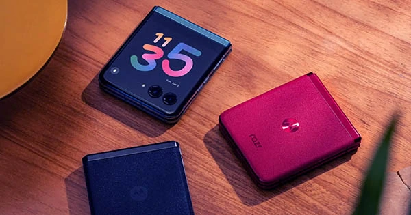
Motorola, as you may have heard, has released a new foldable flip phone. In some markets, it is known as the Razr 40 Ultra, Razr+ in others, and in some locations, it is known as the Razr 2023 or Razr 4. Whatever its name, it appears to be a good flip phone with a larger cover display than the Samsung Galaxy Z Flip 4. And, indeed, that cover display has received a lot of media attention.
The Razr 40 Ultra cover display, on the other hand, is vastly overrated in my opinion. Don’t misunderstand me. Overall, the Moto Razr 40 Ultra is one of the better non-Samsung foldable flip phones, despite the fact that it still looks to lack a real IP certificate. However, the excitement around the Razr 40 Ultra’s cover screen design is, in my opinion, unfounded. In fact, I’d go so far as to say that the Razr 40 Ultra cover screen exemplifies one of the most serious problems in the Android phone industry or the so-called Android influencer sphere: phone designs designed for clicks rather than a better user experience, and the influencers who support them.
Here’s how it works. Nobody compares the Razr 40 Ultra to the current Z Flip 4. And if I had to choose, I’d say the Razr 40 Ultra’s cover screen is more intriguing than the Z Flip 4’s. However, given that Samsung’s next-generation flip phone is just around the corner, the majority of tech aficionados compare the Razr 40 Ultra to the incoming Galaxy Z Flip 5. Both phones attempt to attain a larger, more useful cover screen, but in different ways.
While the Razr 40 Ultra cover screen has three tiny bezels and a larger one at the hinge, as well as two massive display cuts for the cameras and a smaller one for the LED flash, Samsung has taken a different approach.
The Galaxy Z Flip 5 will have three tiny bezels and one wider bezel, similar to the Razr 40 Ultra, although the bezel near the hinge will be prioritized by being thinner. Because the hinge is always at the top when the phone is folded shut, this should improve one-handed use. The bigger lower bezel brings the screen closer to the hinge, making it easier to reach UI elements with your thumb. In theory, at least.
But, more importantly, the Z Flip 5 isolates its camera system in a notch that gives the display a folder-like form. Its cameras do not have huge cutouts in the display. And, while the folder-like notch appears unique, it may benefit the relationship between hardware and software (as well as the user experience).
Most people believe we won’t know which way is superior until the Galaxy Z Flip 5 enters the market. Others argue that the cover screen of the Razr 40 Ultra is simply superior. However, I can already praise Samsung heartily for not following in Motorola’s footsteps and stealing its cover screen design concepts. And here is why.
I believe the Razr 40 Ultra cover screen design provides the impression that there is no notch when, in fact, there is. Motorola’s technique makes the cut-up display region no more useful than a standard notch would. In fact, I contend that it is worse and may get more obstructive.
While Samsung’s Infinity-O selfie camera cutouts on most phones are small enough to ignore (and do not protrude), Motorola’s massive camera cutouts are too large to be usable. Furthermore, they consume large portions of the UI for the great majority of programs running in “full-screen” mode.
As shown in the screenshot below (courtesy of Pocket-lint), two entire Google Maps buttons, namely “Contribute” and “Updates,” are concealed below the Razr 40 Ultra’s cameras. Surprisingly, the letter “e” in “Contribute” appears between the two modules.
This informs me that Motorola did not plan or think much about the design of this product. Very little effort was expended on creatively integrating the camera cutouts with the user experience at the software level. And no amount of cute cat animations for the cover screen, in my opinion, will change that.
Motorola’s software implementation appears to violate the hardware’s architecture. There is no strong connection between the cover display and the software that runs on it. They are two distinct entities that have been hurriedly combined. It’s as if Motola simply turned on the switch that allows complete Android apps to run on the display in order to capture the headlines.
Samsung can’t afford to ignore its notched display design due to what appears to be a more inventive approach. As we previously reported, Samsung collaborated closely with Google to optimize apps for the cover screen. However, due to its design approach, Motorola can pretend that the camera cutouts aren’t there and avoid spending more time and effort on providing a better user experience through hardware and software synergy.
However, a phony larger cover screen will only go you so far. Even Motorola appears to be aware that the camera cutouts make the cover screen less functional by consuming large portions of the UI. Users can decrease the active display area and change the cover screen into a smaller, more rectangular panel by long-pressing the home button on the cover screen.