Anyone who has ever imagined themselves as an astronaut may now glimpse the universe from the comfort of their own home thanks to an interactive map of the known cosmos.
With the new map, you can view almost 200,000 galaxies in color and laid out in their true positions in space, including a few that are so far away that they provide a peek of the Big Bang.
It’s a perspective on the vast size of the observable cosmos that was previously exclusively available to scientists.
Astronomers from Johns Hopkins University used data gathered over the previous two decades by the Sloan Digital Sky Survey to make the night sky accessible to the general public.
Brice Ménard, a professor at Johns Hopkins who grew up admiring astronomy photographs of stars, nebulae, and galaxies, had the concept for the map.
He wished to spread more awareness of its beauty.
In a news release, he stated that astrophysicists from all around the world have been evaluating this data for years, leading to thousands of scholarly articles and breakthroughs. But no one had the time to produce a map that is attractive, factually correct, and understandable to non-scientists. To demonstrate to everyone how the universe actually seems is our aim here.
The galaxy map was created by him and Nikita Shtarkman, a former Johns Hopkins student studying computer science.
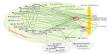
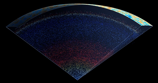
Zoomed out, the image appears to be an upside-down triangular covered in numerous small dots in various bands of color, precisely like a pizza slice of colorful pointillism.
But each dot is a galaxy, not just a star.
Because it takes longer for light to travel from a galaxy farther away from Earth to reach us, this map also looks far into the past. We can see up to 13.7 billion years in the past on the map.
A telescope has been carefully mapping out the night sky in New Mexico as part of the Sloan Digital Sky Survey project by pointing it in various directions and slowly gathering data. This new map was created using just a small portion of the data that it has gathered.
In a video from Johns Hopkins University, Menard stated that “it has gathered data on millions of galaxies out there.”
While there are millions of individual photographs of galaxies, Menard stated in the video that he intended to create a map that provided an understanding of the vastness of the observable cosmos.
It’s really motivating to see how big the universe is, he said.
The map only depicts the galaxies that fit into a thick “slice” that was determined by the telescope as it moved across the sky, not the entire depth of the night sky. A complete map would be spherical and incredibly dense with dotted galaxies, making it difficult to imagine.
Shtarkman claimed in the video that while there is enough data accessible, it is simple to produce a map, it is challenging to organize it into a map that is easy to use.
You’re essentially operating on the largest scale possible, he said.
Viewers may zoom in on the center of the map, which can be accessed online or downloaded for free, to get a clearer idea of how many galaxies are grouped together in the image.
The colors on the map change as you go back in time. This gradient isn’t just for show; scientists use the colors of galaxies that appear to us to determine how far away galaxies or stars are from Earth. Redshifting is the process by which light wavelengths change as it gets farther away from us due to the universe’s ongoing expansion.
The graphic describes elliptical galaxies, which are “yellowish and significantly brighter than spiral galaxies,” as opposed to spiral galaxies like the Milky Way, which are “faint and blue.” A belt of redshifted elliptical galaxies, which are now much harder to view, follows these two.
Galaxies start to fade out around 7.3 billion years in the past and are replaced on the map by brighter quasars, which are gigantic black holes at the center of some galaxies that emit a bright blue light as they draw light into them.
Even quasars undergo redshifting at 11 billion years. The “first flash of light” following the Big Bang, which is detected as radio waves and is referred to as the Cosmic Microwave Background, appears at 13.7 billion years.
The map says, “We cannot see anything beyond this point.” The universe has been around longer than the time it took for light to reach us.
The map also provides users with a series of eye-catching views of what the night sky would look like if we were able to see all of these galaxies with the naked eye.
There is a small placard that reads, “You are here,” near the bottom of the triangle map, the location from which all of the galaxies radiate forth.
“We are only a single pixel at the bottom of this map, Menard claimed in the press release. “And by “we,” I mean our Milky Way galaxy, which is home to billions of stars and planets. Astronomical images typically feature a single galaxy here, a single galaxy there, or sometimes a collection of galaxies. But the scale depicted on this chart is drastically different.”
We can map out galaxies throughout the entire universe from one speck at the bottom, which speaks volumes about the power of science.